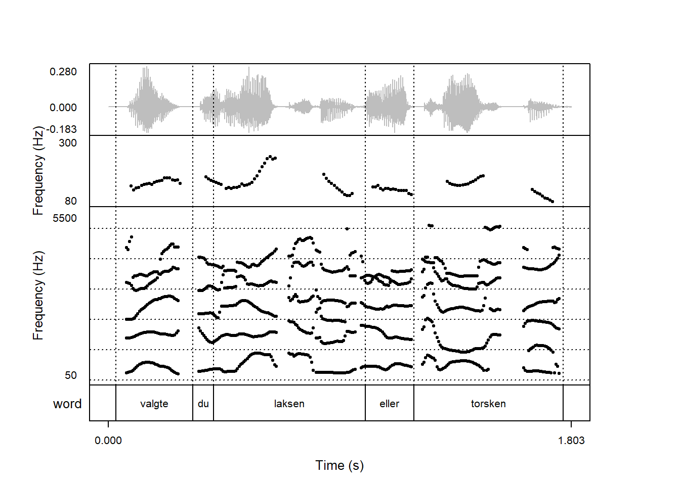
To make part of this plot stand out, you can use the highlight argument. This argument should consist of a named list with information about which part of the signals to highlight. This can be done with the start and end arguments. The list should also contain information about how the signal should stand out, using e.g. the color argument. Here part of the signal (from 0.5 to 1 seconds) is rendered in blue:
praatpicture('ex/ex.wav',frames =c('sound', 'pitch', 'spectrogram', 'TextGrid'),proportion =c(20,20,50,10),wave_color ='grey',pitch_plotType ='speckle',pitch_freqRange =c(80,300),tg_tiers ='word',highlight =list(start =0.5, end =1, color ='blue'))
start and end do not have to be single numbers. If you want to highlight more than one part of the signal, these can be vectors. In addition to highlighting with color, we can also highlight by increasing the point size (with the speckleSize argument) or the line widths of derived signals (with the drawSize argument). Here we increase the point size of the pitch track and change the signal color in two parts of the plot:
praatpicture('ex/ex.wav',frames =c('sound', 'pitch', 'spectrogram', 'TextGrid'),proportion =c(20,20,50,10),wave_color ='grey',pitch_plotType ='speckle',pitch_freqRange =c(80,300),tg_tiers ='word',highlight =list(start =c(0.5, 1.2), end =c(1, 1.5), color ='blue',speckleSize =1.3))
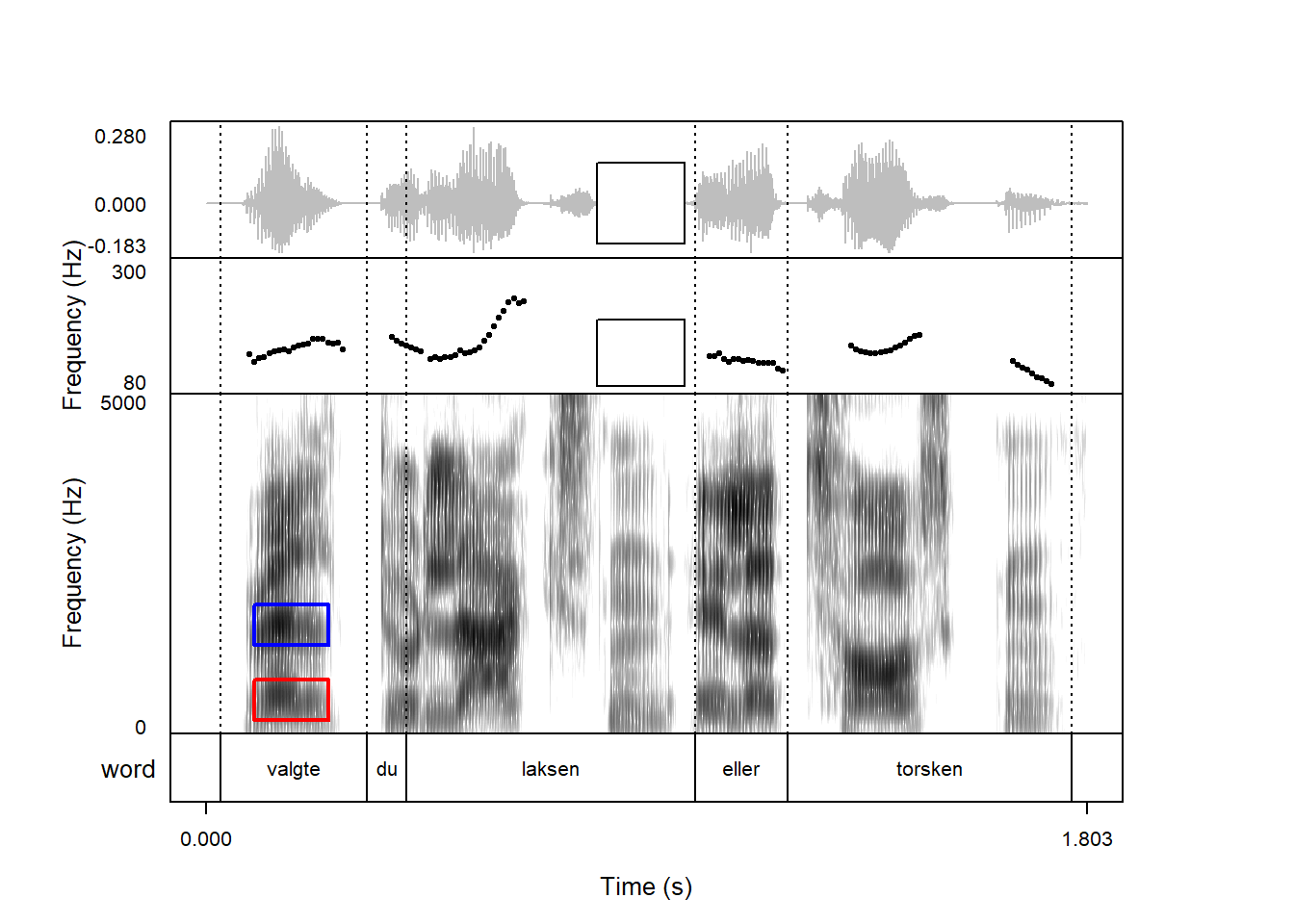
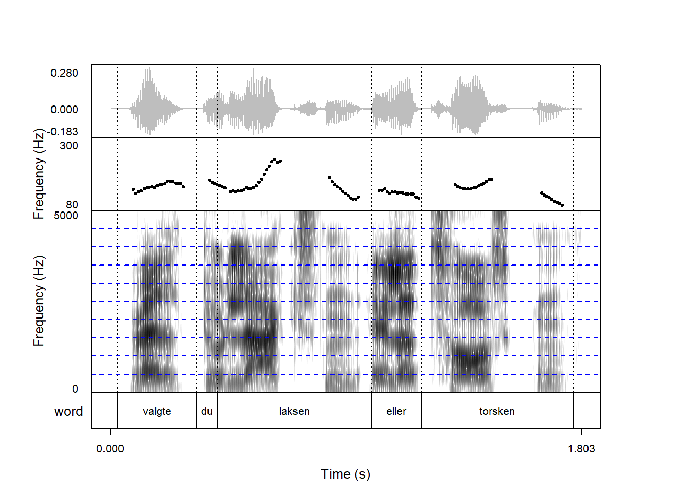
Instead of using the start and end arguments, the TextGrid can also be used to delimit part of the plot for highlighting, by specifying the tier and a label to match. Here, we match the label laksen in the word tier and make it purple:
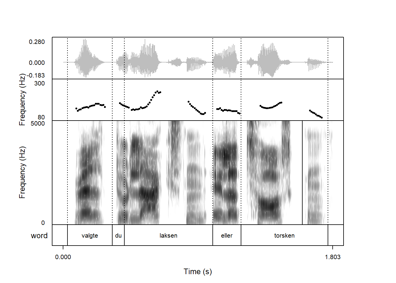
The label argument is evaluated using grepl(), so we can do fancy stuff like matching multiple labels with the OR operator |. Here, we highlight laksen and torsken:
If you want to highlight different parts of a figure in different ways, the list passed to highlight can be nested. Here we highlight torsken and laksen in two different colors:
Highlighting doesn’t have to be done for all signals. In addition to highlight, praatpicture has the arguments wave_highlight, spec_highlight, tg_highlight, pitch_highlight, formant_highlight, and intensity_highlight for highlighting individual signals or highlighting individual intervals in a TextGrid. Here we highlight just the pitch:
The individual *_highlight arguments are structured in the usual way, so if you want to, say, overlay formants on the spectrogram and use festive colors for parts of their trajectory, that’s also possible.
It is possible to combine highlight with the signal specific highlights. In the above case, we might want to highlight all signals, but highlight the formants in a different way to make them stand out on top of the spectrogram. This can be done like so:
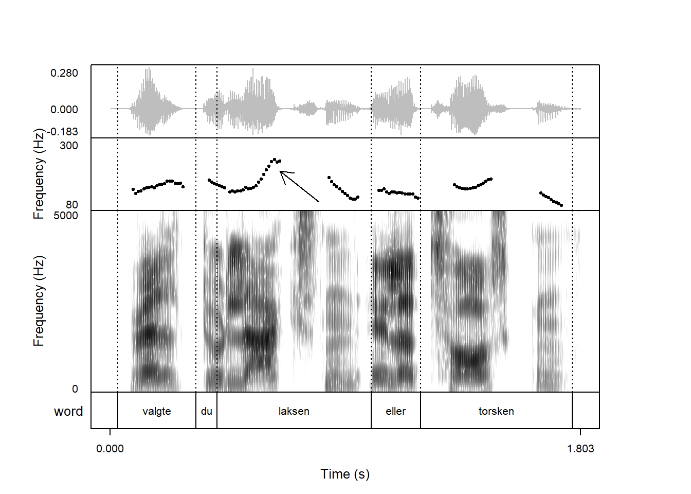
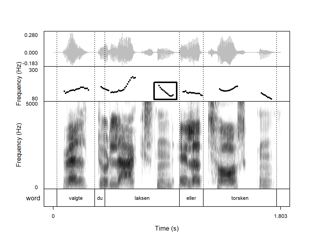
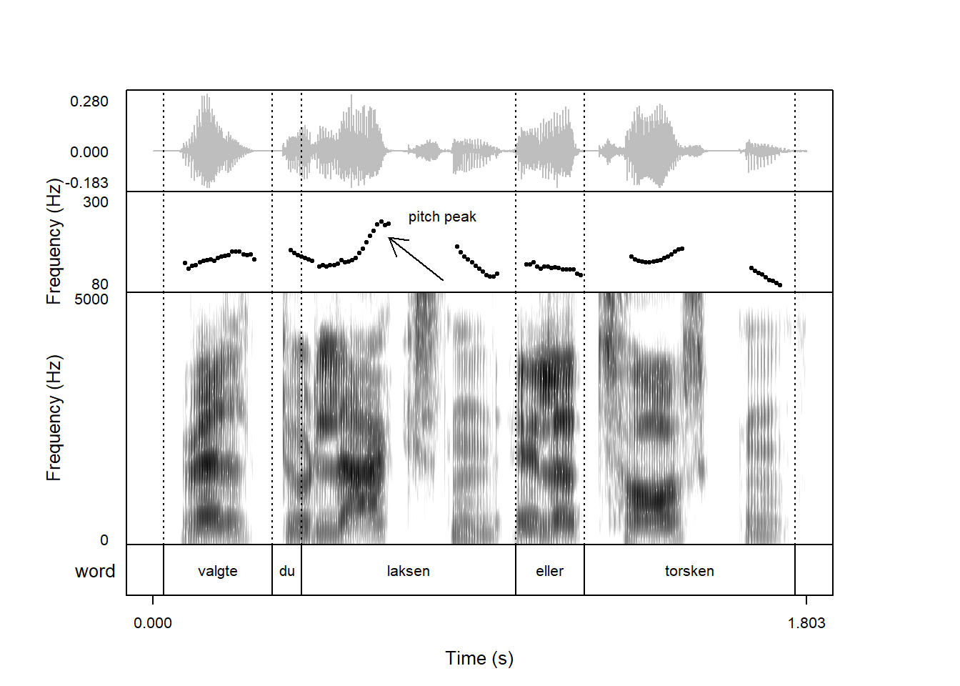
You may want to add an arrow to the above plot indicating the position of the peak in the pitch contour. This can be achieved with the draw_arrow argument. This argument should consist of a vector with the following structure:
the name of the plot component to add the arrow to (in this case pitch);
and arguments for drawing an arrow which are then passed down to the arrows function. You can see what these arguments are by typing help(arrows).
The most important arguments to draw_arrow are the coordinate space: Where should the arrow start on the x-axis, where should it start on the y-axis, where should it end on the x-axis, and where should it end on the y-axis?
In our pitch peak case, we may want to start at 0.8 seconds and 100 Hz, and end at 0.65 seconds and 200 Hz. This gives the following result:
Other arguments to draw_arrow include length, i.e. the length of the arrow head. It’s set to 0.25 inches by default, here we may want to shorten it somewhat:
The code argument determines which way the arrow is pointing; code = 3 will produce a double-headed arrow. Here’s a plot with a double headed arrow showing the gap in pitch tracking the word “laksen”:
It can take a bit of fiddling to get the coordinates just right, but at least the plots are produced quickly!
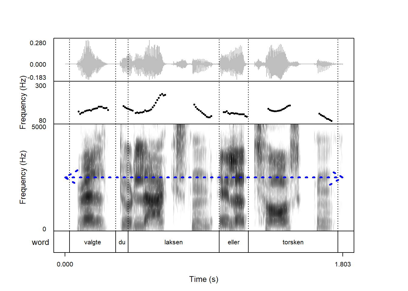
draw_arrow also understands other “classical” base R graphics parameters, such as col for color, lty for line type, and lwd for line width. This would be how to plot a thicker, dotted blue line covering the length of the spectrogram:
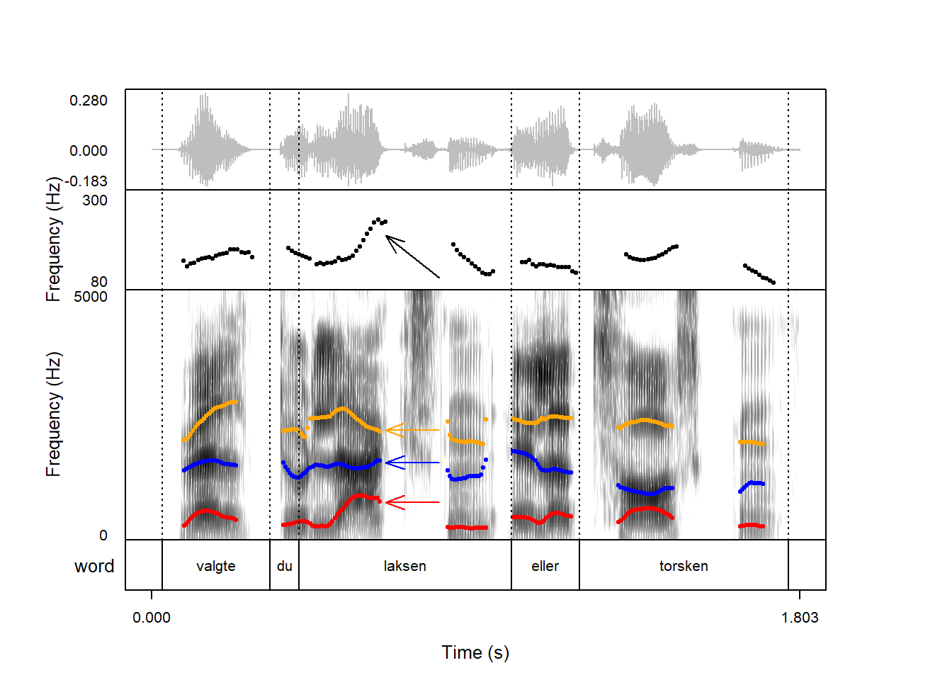
You can add as many arrows as you want to a plot. If you want to add multiple arrows, you just have to pass a list containing multiple arrows with their own separate arguments to draw_arrow. In this plot, we’ve overlaid color coded formants on the spectrogram, and we want to have arrows of matching colors pointing to the formant offsets in the first syllable in “laksen”, in addition to our ‘pitch peak’ arrow from above:
You can draw rectangles on plot components using the draw_rectangle argument. The argument structure is similar to draw_arrow:
the name of the plot component to add the rectangle to;
and arguments for drawing a rectangle which are then passed down to the rect function. You can see what these arguments are by typing help(rect).
The most important arguments to draw_rectangle are the coordinate space: What is the leftmost point on the x-axis, what is the bottom point on the y-axis, what is the rightmost point on the x-axis, and what is the top part on the y-axis? Arguments are presented in this order.
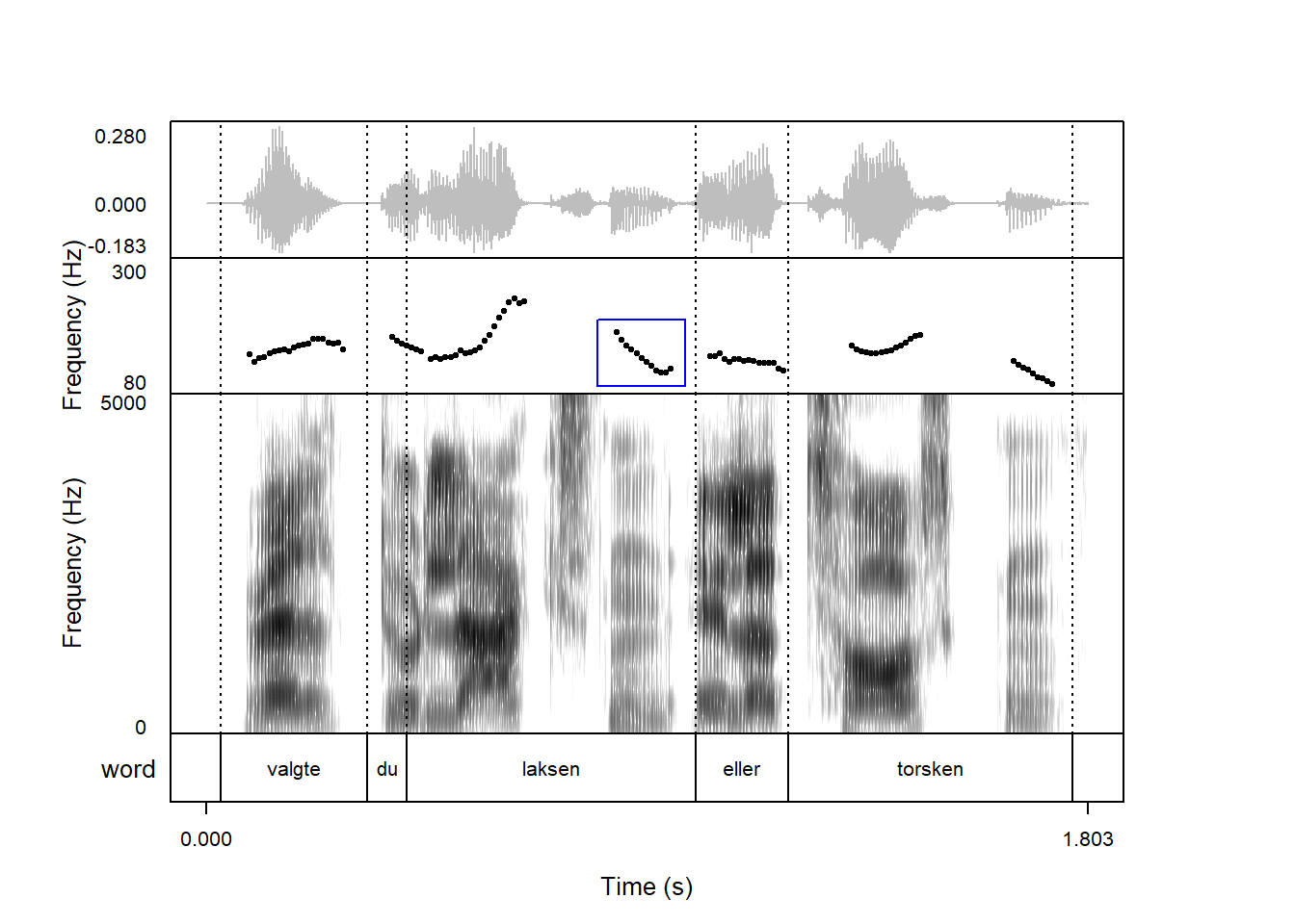
Using the same sound snippet we’ve seen above, perhaps we want to add a rectangle around the pitch contour of the second syllable of the word laksen. In this case, we want the beginning of the rectangle at 0.8 seconds, the lowest point at 85 Hz, the end at 0.98 seconds, and the highest point at 200 Hz, like so:
Other arguments which can be passed to draw_rectangle include col which determines the fill color. If we want to “hide” this part of the pitch contour, we could draw it with white fill:
As is the case with arrows, you can add as many rectangles as you want to a plot. If you want to add multiple rectangles, you just have to pass a list containing multiple rectangles with their own separate arguments to draw_rectangle. Here, we draw rectangles with white fill around both the wave and the pitch track in the second syllable of the word laksen, and we draw slightly thicker rectangles with red and blue outlines respectively around the first and two formants in the spectrogram of the word valgte:
There are a few other options that can be passed to draw_rectangle which aren’t covered here; see help(rect) if you’re interested.
9.4 Straight lines
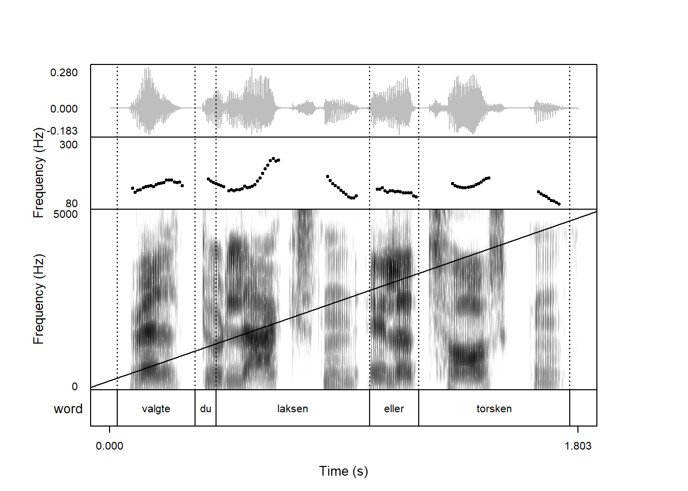
In addition to arrows and rectangles, the argument draw_lines allows you to add one or more straight lines to a plot. The structure of draw_lines arguments is a little different from draw_rectangle and draw_arrow, but mostly in the sense that it has to be a list instead of a vector (i.e. list() and not c()). The first element of the list should be the plot component to draw on, and other elements are arguments to be passed to the abline() function. See help(abline) for more information about this.
In the figure that we’ve seen previously, we could add a horizontal line at 2,500 Hz in the spectrogram by passing h = 2500, like so:
You can also in theory add a regression line by specifying an intercept a and slope b. Here with an intercept of 250 Hz and 2,500 Hz:
praatpicture('ex/ex.wav',frames =c('sound', 'pitch', 'spectrogram', 'TextGrid'),proportion =c(20,20,50,10),wave_color ='grey',pitch_plotType ='speckle',pitch_freqRange =c(80,300),tg_tiers ='word',draw_lines =list('spectrogram', a =250, b =2500))
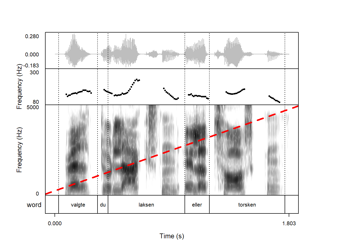
As with lines and rectangles, we can control color with the col argument, line type with the lty argument, and line width with the lwd argument. Here I repeat the previous plot with a thick, red dashed line:
praatpicture('ex/ex.wav',frames =c('sound', 'pitch', 'spectrogram', 'TextGrid'),proportion =c(20,20,50,10),wave_color ='grey',pitch_plotType ='speckle',pitch_freqRange =c(80,300),tg_tiers ='word',draw_lines =list('spectrogram', a =250, b =2500,col ='red', lty ='dashed', lwd =3))
If you’ve ever plotted formants on their own using praatpicture, you will have seen the draw_lines argument in use before see 7.1.7:
Formant plots show horizontal dotted lines at multiples of 1,000 Hz. This is because the default value for draw_lines is list('formant', h = seq(0, 10000, by = 1000), lty = 'dotted'). Let’s unpack this. The h argument indicates that the lines should be horizontal, and instead of passing a single argument to his we pass a vector made with the seq() function. seq(0, 10000, by = 1000) returns the following vector:
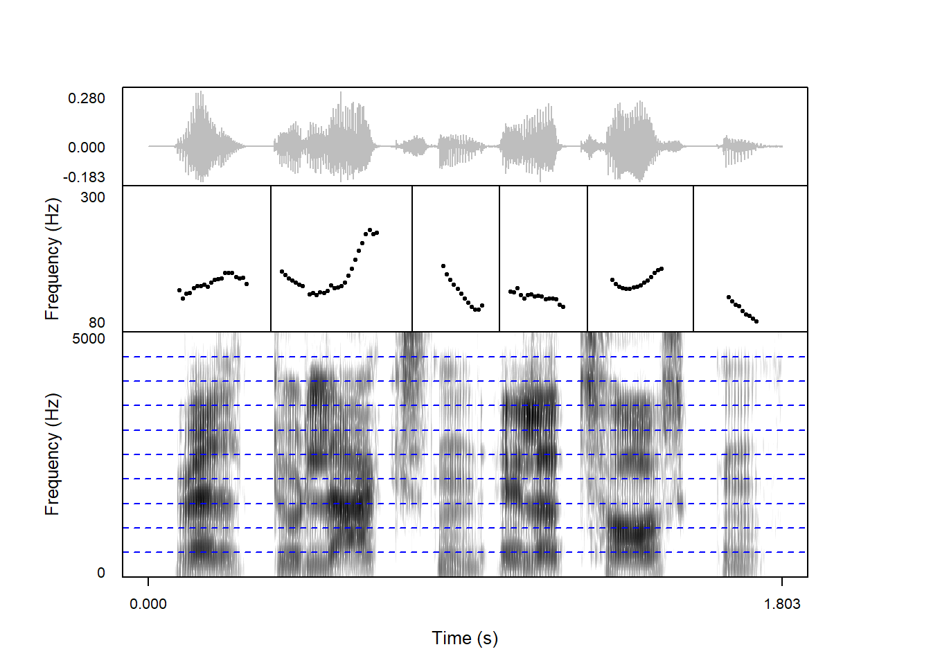
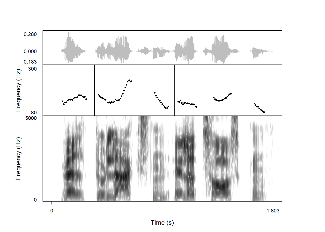
If you don’t plot a TextGrid, or wish to add vertical lines to just one plot component, this is also the way to do it. Here we add straight lines between each of the syllables on the pitch contour:
If we want to add more sets of lines with different parameters, we can also do this, by passing a list consisting of multiple lists. Here we combine our two last plots:
praatpicture('ex/ex.wav',frames =c('sound', 'pitch', 'spectrogram'),proportion =c(20,30,50),wave_color ='grey',pitch_plotType ='speckle',pitch_freqRange =c(80,300),tg_tiers ='word',draw_lines =list(list('pitch', v =c(0.35, 0.75, 1, 1.25, 1.55)),list('spectrogram', h =seq(0, 5000, by =500),col ='blue', lty ='dashed')))
9.5 Text
You may want to add some text to a plot apart from the annotations found in a TextGrid. You can do this with the annotate argument. This argument should consist of a vector with the following structure:
the name of the plot component to annotate;
and arguments for annotating which are then passed down to the text function. You can see what these arguments are by typing help(text).
The most important arguments to annotate are the the coordinate space and the text to include. Where should the text be placed on the x-axis and where should it be placed on the y-axis? The coordinate space is controlled with the x and y arguments, and the text is controlled with the labels argument.
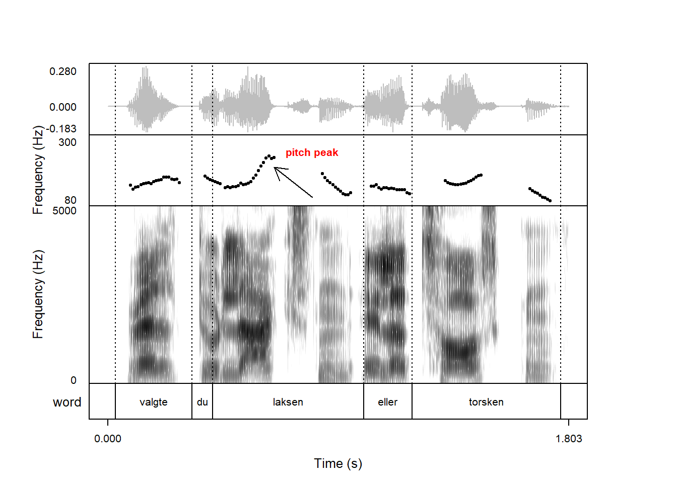
Above, we made a plot with an arrow pointing towards the peak on the pitch contour. We may want to add a label to this plot saying “peak”. This can be done like so:
The font argument can be used to control the font type, with 2 corresponding to bold, 3 corresponding to italics, and 4 corresponding to bold italics. Here’s the same plot as above using a bold-face font:
Changing the font size and type of this type of annotation is only possible if you have the latest development version of praatpicture installed.
9.6 Highlighting multichannel audio data
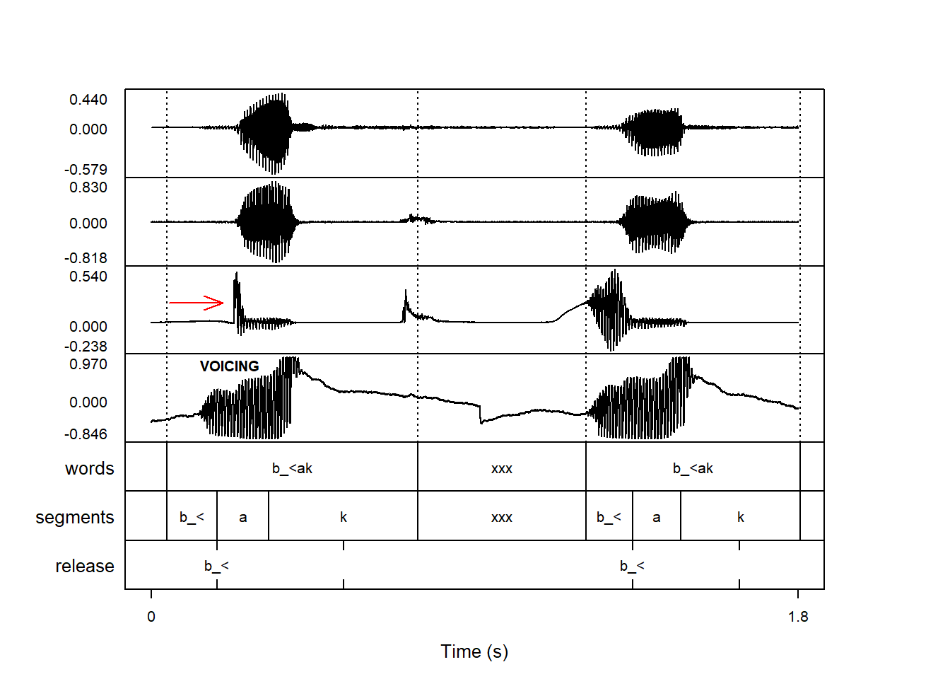
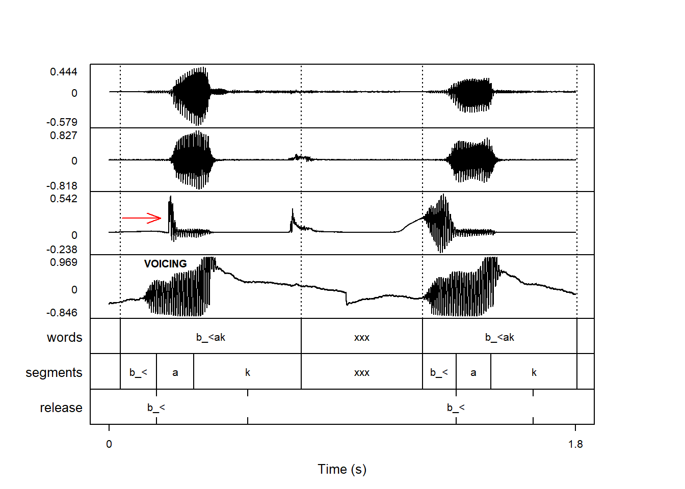
If you have data with multiple channels and you want to highlight just one of those channels, instead of writing sound as the first part of the highlighting argument, you can write the number of the channel instead. Here, we add an arrow to the third signal and write some text on the fourth signal:
praatpicture('ex/multichannel.wav',start =0.6, end =2.4,frames =c('sound', 'TextGrid'),proportion =c(70, 30),draw_arrow =c(3, 0.05, 0.22, 0.2, 0.22, col ='red',length =0.15, angle =20),annotate =c(4, 0.22, 0.8, 'VOICING', font =2))